Summary
Client: Floracracy
Project: Product Strategy, User Research & Design
Role: UX Designer, UX Researcher
Methods: Usability Testing, SME Interviews, User Interviews, Concept Testing, Wireframing
Background
Floracracy is an online floral arrangement retailer that specializes in giving their users the ability to personalize high end arrangements to their unique preferences.
Objective
Our team objectives were to…
Research existing user flow
identify problem space for potential users
Strengthen MVP to move out of Beta
The Problem:
Thoughtful flower gifters need to feel reassured that their arrangement will meet their expectations. If this wasn’t the case, customers would not feel confident enough to complete their purchase.
Project Background
Floracracy is a floral arrangement retailer that specializes in giving their users the ability to personalize high end arrangements to their unique preferences. With my time working with Floracracy, our team was able to help expedite company progress getting out of Beta, strengthening their MVP to deliver a seamless customization process to their customers. With our work we were able to help build on an experience, empowering flower gifters to customize an arrangement that feels personal, memorable and meaningful.

Initial Assumptions
Being operational for 12 months, Floracracy has collected research on their existing MVP site. Floracracy stakeholders detailed two potential problems that could be causing user fall-off from their website.
Usability issues within the beta site kept users from the full experience
Potential users could feel self conscious, lacking the knowledge or confidence in making purchasing decisions for their recipients.
It is up to our team to validate Floracracy’s assumptions by conducting thorough research of our own, understanding the current user experience and task flow of the website.
Research
What users were seeing…
Before conducting user tests, our clients had provided us with a demo of their MVP site. With this demo, our team of designers can understand how Floracracy intends its users to go through the flow of creating and purchasing a floral arrangement.
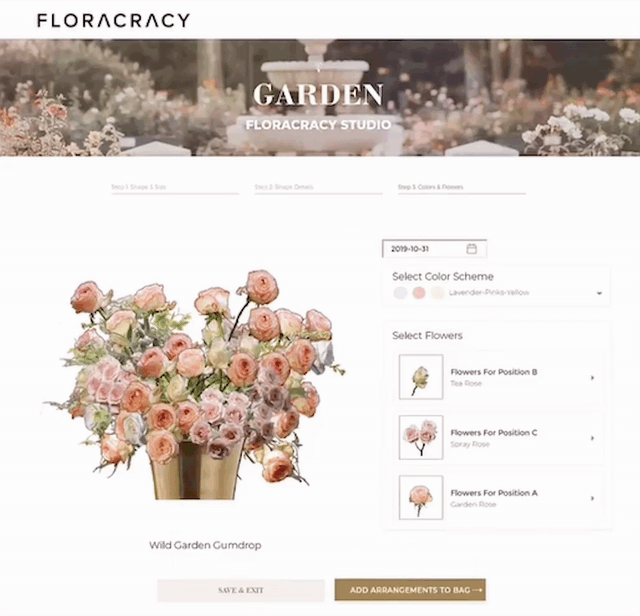
Floracracy's floral arrangement designer (Story Studio) is a tool that guides users to creating their own custom arrangements focusing on style, color, shape, size and flower type.
Interviews
To understand the current problems facing Floracracy customers, our team conducted interviews with (2) Subject Matter Experts and (6) users that were interested in floral arrangement gifting. These interviews gave us valuable insights about Floracracy customer habits and decision making. User testing allowed us to evaluate the initial assumptions that were discussed previously and validate if there are the underlying cause of low conversion rates.

User Testing Floracracy initial MVP via zoom app.
While conducting research during user tests, our team wanted to determine the following about Floracracy’s potential customers…
Q: Was the Floracracy value proposition clear while navigating the website?
Q: What were user habits, motivations and behaviors going through the flow?
Q: Were usability issues preventing users from completing their floral designs?
Insights
During our research, we studied that people were fundamentally creative and didn't lack the confidence or knowledge to keep them moving forward through the user flow, as stakeholders previously assumed. We learned that users desire gifts that create experiences, making this exchange more unique and less comparable than gifting material goods. Ultimately the users we had conducted tests with understood Floracracy's value proposition, that people want control over the flower customization process. Today, material gifts are the expected social norm from the gift giver. Breaking these normalities demonstrates a level of thoughtfulness, making the exchange a more sentimental one.
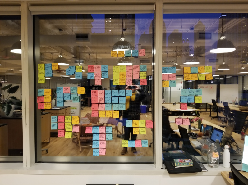
Affinity Map of User Interviews + Testing

Quote from User Testing
“It’s when I’ve lost a little bit of control over what’s being sent that I have been disappointed”
Jeanne, User Interview
“I think it's about trusting that what you're buying is going to be great. Once you trust that what you buy is going to be great, and you have some sense of like what the process is... ...that should not be intimidating for most people.”
Harry, SME Interview
Customer Journey Map

Identifying the problem

Testing revealed that usability issues throughout Story Studio (Arrangement builder) flow wasn’t the reason for lack of conversions, instead it was in the checkout flow. When entering the checkout, the users should feel the most confident and excitement about their purchase, when the opposite was happening. Users felt they were most uninformed on this page, where they didn’t quite understand the value of their purchase. Leaving the users with a lack of confidence and uncertainty around the arrangement they’ve just made.

Here on the cart page, was where we were finding users not converting their designs into purchases. The users we tested hesitated due to feeling underwhelmed and uninformed about what they were actually buying. Floracracy's Value proposition must be derived from beginning to the end of the flow. Despite the Usability issues, users were excited to use the website and thrilled to be able to customize their own arrangements.
Problem Statement
These key insights we derived allowed our team to develop the following problem statement.
Thoughtful flower gifters need to feel reassured that their arrangement will meet their expectations. If this wasn’t the case, customers would not feel confident enough to complete their purchase.
Concepts & Testing
Design Principles
Clarity, Limit Ambiguity. Enabling flower gifters to see exactly what they’re getting.
Excitement, this design will be inspiring and fun, sparking a sense of joy.
Certainty, Ensure flower gifters feel comfortable and decisive when completing their purchase.
Concept Testing


After brainstorming various ideas, we were able to come up with three overarching concepts, containing nine ideas in total to design from. Each of the concepts chosen had to align with the problem we were trying to solve while satisfying our design principles, in the interest of being as lean and effective as possible. These three concepts were then tested with eight participants conducted over the course of three rounds. Participants were asked a series of questions in an attempt to learn if our designs met what we were setting out to accomplish, instilling confidence in user purchases.
Concept 1
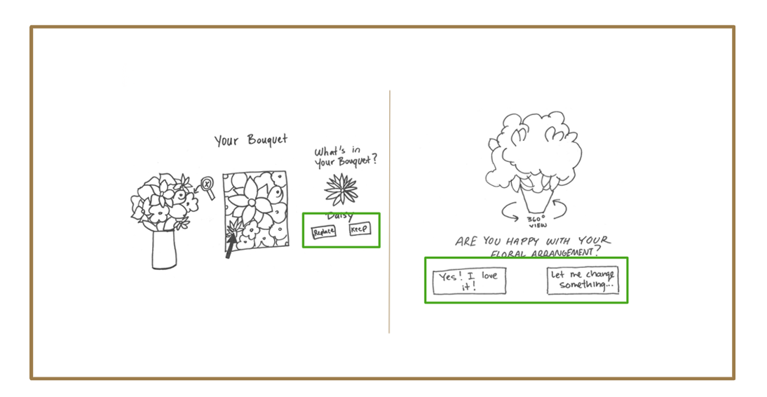
Shows final floral arrangement with the ability to modify.
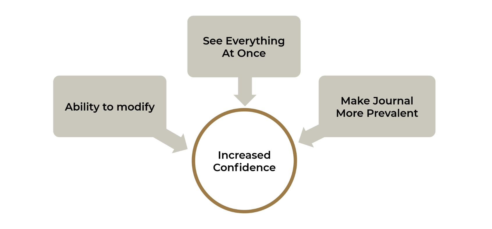
The first concept, we aimed to show the final floral design with the ability for the user to modify their arrangement. During usability testing, a number of users noted that while they found Floracracy’s visualizer tool useful, they didn’t always find it aesthetically pleasing. With this concept we hypothesized that it could build user confidence to give them a once over at the finished arrangement, in greater detail. Conversing with key stakeholders and through testing, it was discussed that users needed the ability to make changes easily without having to backtrack, in result building user confidence.
In concept 1, users really gravitated to the ability to go back and edit their arrangement, confirming that they’re happy with the end result of their floral design. Reassuring the customer that they have the ability to change their minds with no difficulty.
Concept 2

Presentation of all items in the purchase order.
For the second concept, referencing our design principles, we wanted to confirm that buyer expectations are met before they get to the checkout page. After completing their floral design in the visualizer tool, users will be given a presentation of all of the items included in their purchase order before check out.
In this concept, users verbally stated that they loved seeing exactly what they’re getting in their purchase order, and that the value is immediately apparent upon viewing. We discovered that the ability to review each item description was important to them and that a hover interaction was the best way to disclose the information on this design. Customers want to be shown everything at once because it’s efficient and transparent.
Concept 3

Write and visualize the message for the Story Journal.
In the third concept, our team explored different ways for the users to visualize and write their message into the story journal. During initial testing, users expected that the writing component of their floral creation would be more prominent, leaving them with the underwhelming feeling that the flow was missing a step.
With the Story Journal in concept 3, users stated the importance of including the message in the flow, and how combining your story along with the meaning of the flowers is what makes the gift so special and unique. That clarity in the display of the personalized message fosters confidence in the customer’s purchases.
Prototype
Converging Concepts
Discussions between our team would take place on how we could implement the concepts we had created and create a pre-checkout flow, to ensure users are satisfied with their purchase. Reassuring the consumer what they're seeing is what they're getting. By looking at other UX design patterns, our team created a more transparent customization process, allowing for the consumer to customize their gift with a personalized message or to complete their purchase in fewer steps.
Proposed Solution

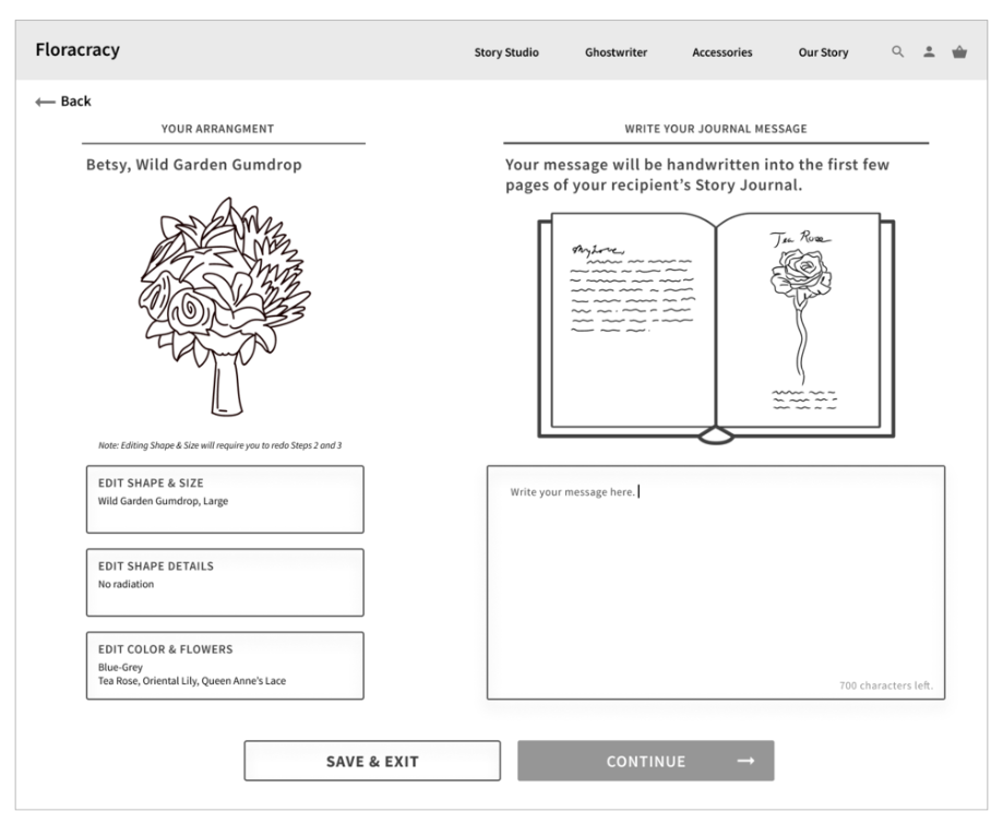
Message Page
Here users are able to both edit aspects of their arrangement and enter the message in their story journal. On the left here you can see that they can easily edit each discrete step of the story studio process, while on the right they are given a simple but prominent way to type out of their message, while being provided with a preview of what the journal will look like. We decided to combine these two ideas on one page because we wanted to limit the number of steps users had to take before entering the checkout.
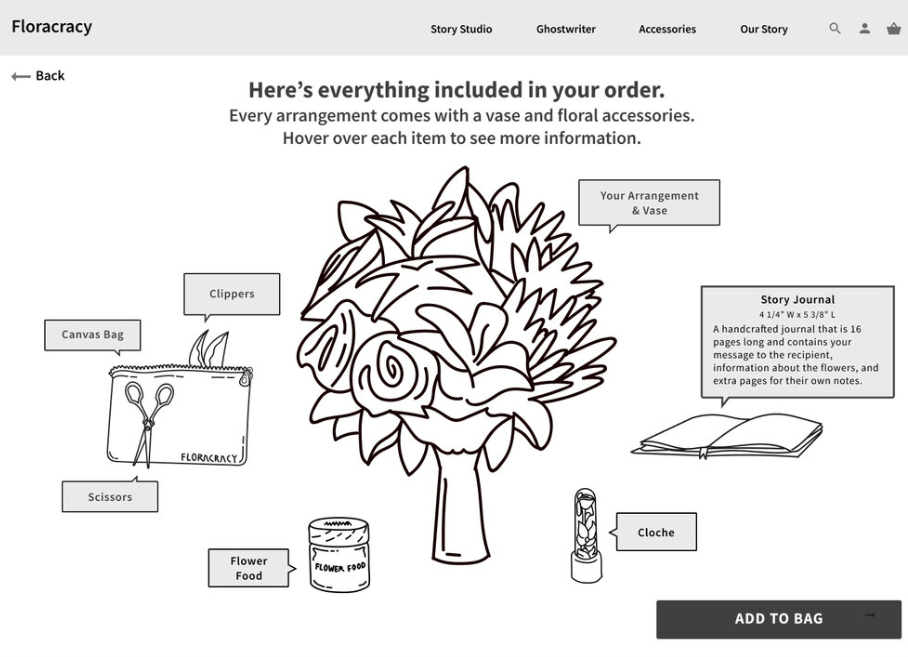
Full View Page
In this flow, users were given a view of every item in their purchase order, with the ability to hover over each item to learn about the product details. Through concept testing, users reiterated that they preferred a simple, straightforward display that showed them each item at once because they value efficiency.
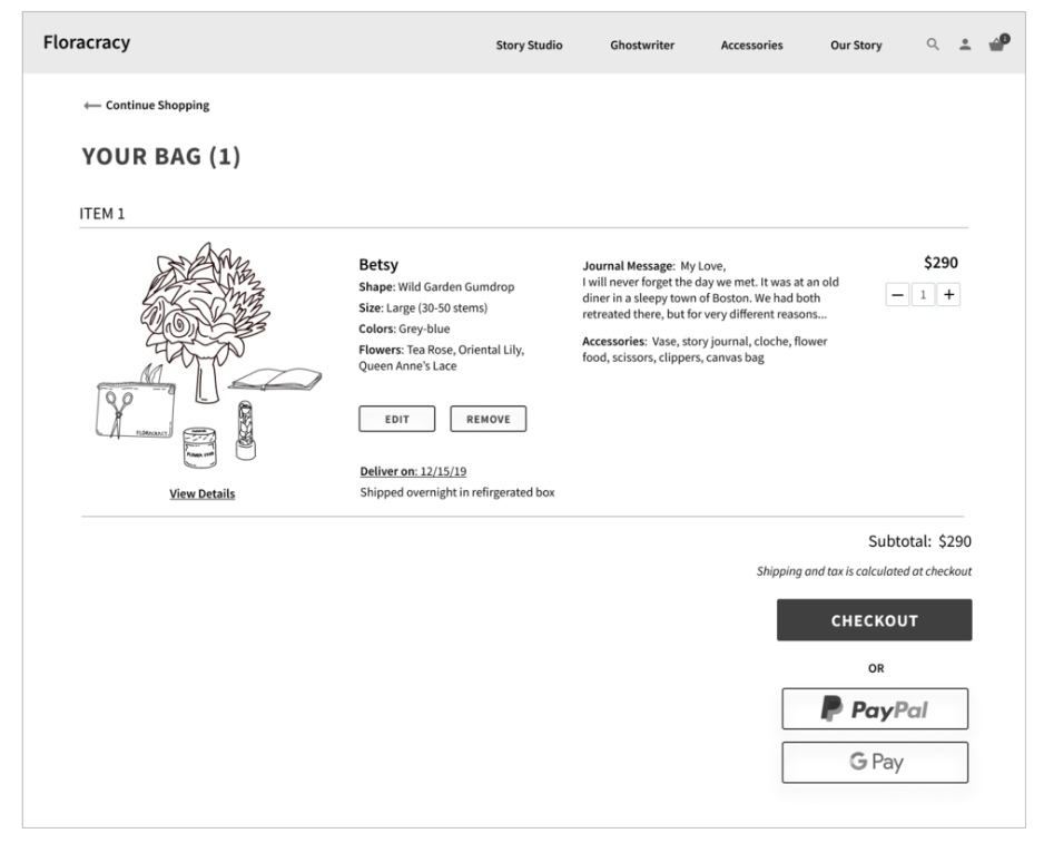
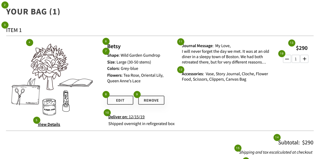
Your Bag (Cart) Page
In the final part of the flow, we have “Your Bag”. After conducting a heuristic analysis of the current cart page on the Floracracy site, we determined that some of the components on the previous cart page didn’t align with our fundamental design principles. Using our analysis and insights gathered through testing and research, we were able to deliver a redesign of the bag(checkout) page to make it more usable and informative for Floracracy’s consumers.
Usability Test Reactions
Usability test participants displayed overwhelmingly positive reactions to our prototype. With one of our participants stating the following…
“When it comes to spending this kind of money on a floral arrangement, it gives me more confidence when I’m seeing all the pieces and you can see there’s a lot of detail and care. As a person about ready to purchase, this is the point where I might be like, you know, I don’t know if I want to spend the money. So the amount of detail and the way it’s laid out helps reinforce that, yes, I do want to spend the money”
Karianne, User
Conclusion
Future Recommendations
Due to time constraints, our team has given Floracracy future recommendations for product improvements that would continue to bolster their MVP.
Usability Recommendations (Immediate)
Ensure consistent language is used across entire website
Implement clear and consistent primary buttons and back navigation across entire website
Continue to test wording of descriptions of accessories
Usability Recommendations (Future)
Explore and test other names for Story Studio and Story Ghostwriter
Experiment with ways to provide users with support in writing a message in Story Studio
Future Business Strategy Recommendations
Continue to test the desirability of accessories and consider alternate pricing models
Consider alternate options for a journal
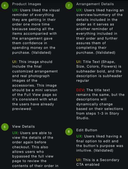
Annotated Wireframes
In order to confirm our work would be implemented correctly by Floracracy, our team had created annotated wireframes.
Final Results
With only 3 weeks to improve upon Floracracy’s initial MVP, our team was able to not only meet stakeholder goals set at the beginning of this project, but improve upon the consumer experience all while meeting user needs.
“ I don’t think we actually looked into the checkout process. The greatest value the team brought was identifying a problem we had never thought of ”
— Nathan Marchese, CPO Floracracy
Reflection
The art of storytelling is instrumental for creating a better user experience. Using such a key practice helped our team reach an understanding of the customer experience, how we were able to understand and empathize with Floracracy's consumer base. By implementing an agile methodology, we were able to quickly iterate for our client's problem. Our main objective was to have the value of the purchase directly translated to the consumer and in result, we were able to instill confidence throughout the user experience so at the end of the purchase, users were confident what they're getting is what they will receive.
